What belongs in a calendar Today view?
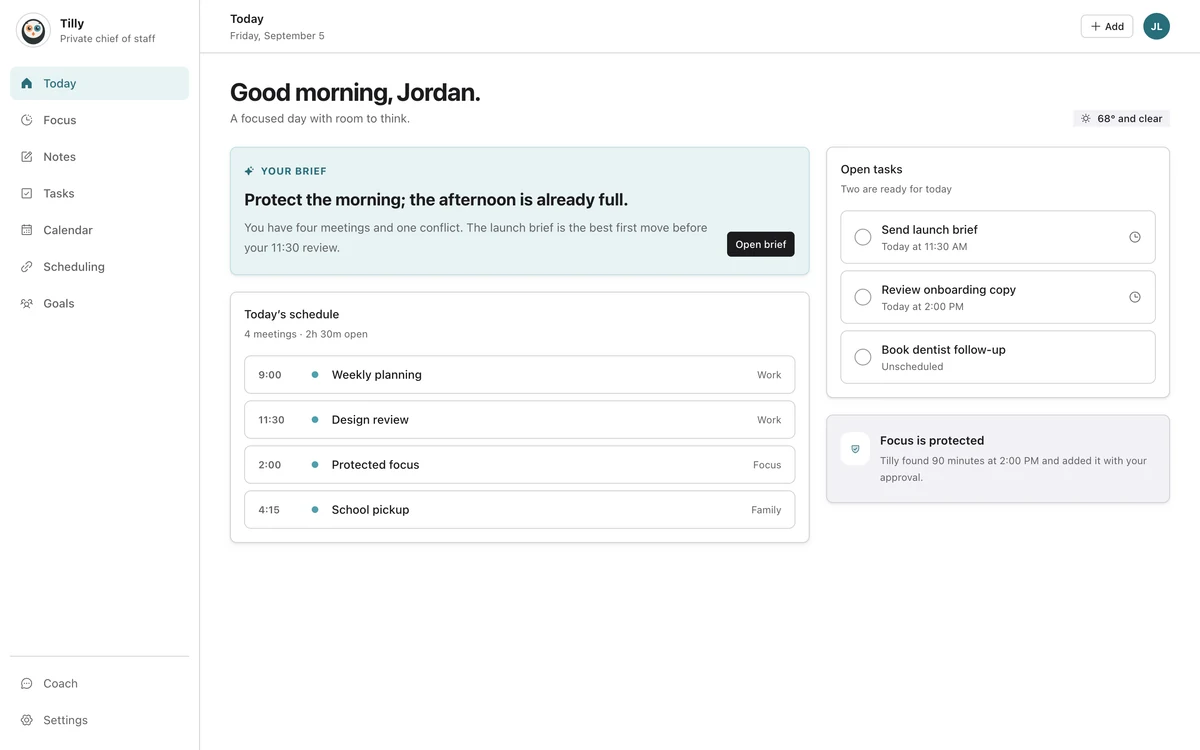
A useful Today view should answer four questions quickly: what happens next, what needs attention, where do commitments overlap, and how much usable time remains. Everything else has to justify the space it takes from those answers.
This is an editing problem, not a data problem. A calendar may know about hundreds of future events, old tasks, guests, attachments, locations, and settings. The daily view should not repeat the database. It should select the details that change today's decisions.
Start with the decision, not the widget
Product teams often begin by arranging components. Put the next event here, a task list there, a weather card below. The page can look organized and still fail because the pieces do not form an answer.
The stronger starting point is a moment. Imagine someone opening the app at 10:18 after a meeting ran late. They need to know whether to start a task, leave for the next appointment, or repair a conflict. The view should make that choice easier before it offers a tour of the product.
Keep the next fixed commitment obvious
The next event anchors the day. Its start time, title, calendar, and location often matter. A long guest list or conference description usually does not. Those details can remain available when the event opens.
Showing the calendar source is important when several accounts share a view. A school event, a work meeting, and a personal appointment may require different actions even when their times look identical.
Treat open time as a real object
Most calendars draw events and leave the rest as background. That makes commitments easy to count but makes capacity harder to judge. A Today view can name the next useful opening and show its duration without pretending every blank minute is productive time.
Open time should account for what the calendar can know, then leave room for human judgment. Travel, preparation, meals, and recovery can turn a ninety-minute gap into a much smaller working window.
What should stay one step away?
- The full month grid when today is the decision.
- Settings that do not change the current plan.
- Old completed tasks and distant deadlines.
- Full event notes, attachments, and guest lists.
- Every possible action for every item.
Removing these details from Today does not make them unimportant. It puts them at the depth where they become useful. The daily page stays small; the complete calendar and item detail remain available for planning and repair.
Use hierarchy that survives a two-second glance
A person should be able to identify the next event, the main task, and a conflict without reading every label. Size, spacing, and position should carry most of that work. Color can help identify calendars, but it should not be the only signal.
We test the page by looking away, returning for two seconds, and then describing what stood out. If a secondary statistic wins that test, the hierarchy is wrong. If everything looks equally loud, nothing is leading.
Design for change without making the page nervous
Today changes as time passes, tasks finish, and meetings move. Updates should feel stable enough to follow. Constant reordering can make the user hunt for an item they saw a moment ago.
A useful rule is to reorder when the decision changes, not whenever any field changes. The next event can advance. A resolved conflict can disappear. A task does not need to jump because a less important attribute updated.
Questions people ask
Is a Today view the same as a day calendar?
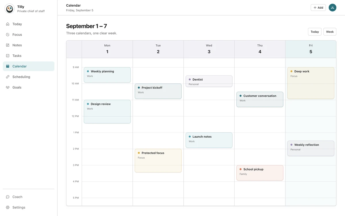
No. A day calendar shows the schedule across a time grid. A Today view can summarize the next event, selected tasks, conflicts, and open time. The day calendar is better for spatial comparison; Today is better for a quick decision.
How many tasks should Today show?
Show the tasks that can reasonably receive attention today. There is no universal number. The list is too long when the important item becomes hard to find or when unfinished work is carried forward without a decision.
Why not show the whole week?
The week is useful when the decision spans days. It is noise when someone only needs to know what happens next. Keep the week easy to reach, but do not make every daily check pay its visual cost.